
mocha pink gem
Featured


MODERN BLUE KITCHEN
Featured


ALETA’S DESIGN NOTES
Like any kitchen remodel a great deal of planning and attention to detail are involved. The most important thing to the client for this kitchen was to be able to maneuver in the kitchen with ease. After all, the kitchen is where we spend a vast amount of our time. This remodel required a complete gut down to the studs in order to accomplish what the client desired.
The client wanted to keep the design simple and clean, therefore we used a minimal amount of materials; white tile, wood cabs and accents, Marmoleum, and quartz.
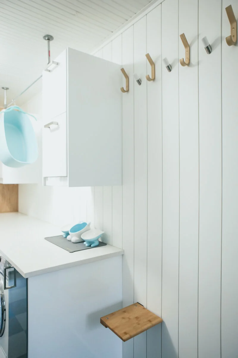
This particular home was built right on the cusp of 1950. The home was not built with an open concept, so we decided to keep that consistent throughout the kitchen remodel. The laundry room was adjacent to the kitchen but access to it was with a very narrow open doorway. We opened the doorway up a bit, making the kitchen almost an L shape, but still with enough delineation between the main kitchen area and the laundry room to make them feel like separate spaces. Although a bit unconventional, the refrigerator is located in the laundry room, keeping busy refrigerator traffic out of the way of a cook using the main counter, sink, and oven area. This also provided a wide walkway to and from the door that leads into the attached garage from the kitchen, without a large bulky refrigerator in the way. In order to bring more light into the laundry space, we blew out the wall and installed a sliding glass door that leads onto the covered deck, making an easy transition from indoor to outdoor living spaces. The quartz countertop located on the washer/dryer side of the laundry room provides a surface to put perishables from grocery shopping or items needed in and out of the fridge.
The kitchen windows face the front of the house and we wanted to maximize the light that pours into the space. The client also loves the colors blue and green, so we added gradients of both throughout the color palette. To keep the space light and bright, we used ‘All White’ by Farrow & Ball on the walls, trim and ceiling, and we used light ash cabinets to add texture and not heaviness. The cabinets in the laundry space are a high gloss white with blue/green gloss doors dotted in for fun. To balance the main kitchen cabinets and the light ash color, the wall where the sliding glass door was installed is finished with a light birch and trimmed to create squares and rectangles; a nod to Mondrian, whom became very popular posthumous in the 50's and late 60's.
The existing kitchen had upper and lower cabs and a soffit running along the wall above the windows, creating a very cavelike feeling and crowded workspace. To keep things crisp we removed the soffit, and used a mixture of high-gloss and matte white extra large subway tiles all the way up the wall. We gained storage space by carefully planning the exact lower cabinets needed for dishware, utensils, pots and pans, and pantry items so that the plan to not install upper cabinets kept in line with the space becoming light and bright. We included deep drawers to store glasses, food storage containers, and tabletop items as to not clutter the walls and countertops with practicalities, but instead to highlight elements of personal items in the kitchen such as art, books and sculptural accessories.
The Marmoleum is a nod to the 1950's heritage of the home, and we configured the pattern on graph paper using the three colors; dotting the blue/green squares in here and there for color. The door that leads into the attached garage is painted with Benjamin Moores' chalkboard paint so notes and lists can be seen by everyone in the household before leaving to run errands.
Overall, the kitchen achieves easy movement for cooks, bakers, and taste testers alike while providing a calm, relaxing, and most importantly simple space to dwell and gather.
ECO “GREEN” KITCHEN
Featured


ALETA’S DESIGN NOTES
A bit of Feng shui for this mid-century modern home was used as the main source of inspiration. Feng shui practice is based on the idea that the center of the house is the "heart of a home" and should reflect the overall wellness and light in a home. It was apropos the kitchen was located in that space on this project. It was very important for the homeowner to have the kitchen reflect health and wellness and what better way to do that than to use sustainable materials, textures and finishes sourced from the Earth.
The color palette came naturally from using eco-friendly materials like cork, bamboo, and grasscloth and mixing reclaimed metals like copper and stainless steel.
-Bamboo was used for the custom cabinets painted with a clear low VOC water-based finish.
-Paperstone countertops made from 40% recycled paper and concrete.
-Cork flooring and grass- cloth used for the wallcovering on the "serve-thru" portion of the kitchen.
- Yolo Colorhouse no VOC paint in Grain #5 used on the top cabinets.
-Sheet of recycled Stainless Steel magnetized used over the vent above stove so recipes could be placed with a magnet above the stove.
The island was built on castors so it could be moved with ease to the kitchen side serve-thru counter bar area for extra seating. It was built with a mixture of materials using bamboo, paperstone, and reclaimed copper. A hole was cut out on the top of the island to push organic waste into a built-in drawer that acted as a compost, or garbage. The island itself was left open underneath to provide an industrial feel and to avoid any heaviness in the center of the kitchen.
The kitchen radiated natural warmth and comfort and became the hub of the home for the owner. The eco-friendly finishes also made guests feel welcome and naturally inclined to gather in the kitchen for meals, cheers, and laughs for years to come.